Uber.com Redesign
Global User Research / Prototyping / Product Strategy / Design Systems
May 2017 - Dec 2018

Context
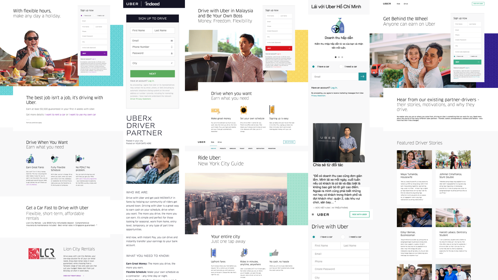
Prior to 2017, in order to support their rapid growth, Uber had built a massive global website that prioritized quick, templated publishing for local teams. But this autonomy to publish had created thousands of outdated and unsupported pages that were impacting user’s experiences and sign ups. The ultimate experience was confusing and inconsistent for riders and drivers around the world.
While grappling with their unwieldy global website, Uber was also questioning the purpose of the platform - they knew that both riders and drivers could sign up and become regular users without ever visiting uber.com. So Uber asked our team to help them establish a clear purpose for Uber.com to better serve the needs of riders, drivers, and the business.
Finally, in the midst of all of this foundational site redesign, we were also tasked with interpreting Uber’s new brand for the web.
The Challenge
Find a purpose for Uber.com to better serve the needs of riders, drivers, and the business.
Simplify and streamline the global site architecture.
Interpret Uber’s new brand to the platform of a globally accessible and responsive website.
Discovery
Immersive User Research
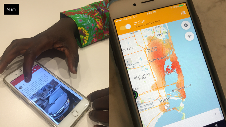
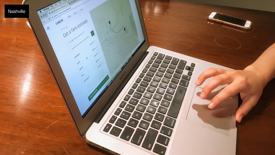
In order to better understand the lives of riders and drivers our team designed a research plan that we implemented in three different US markets (Nashville, Miami, and New York).


Site-intercept Survey
While we were in the field doing qualitative research, we also launched a massive site-intercept survey to gain insights into visitor demographics and website effectiveness.

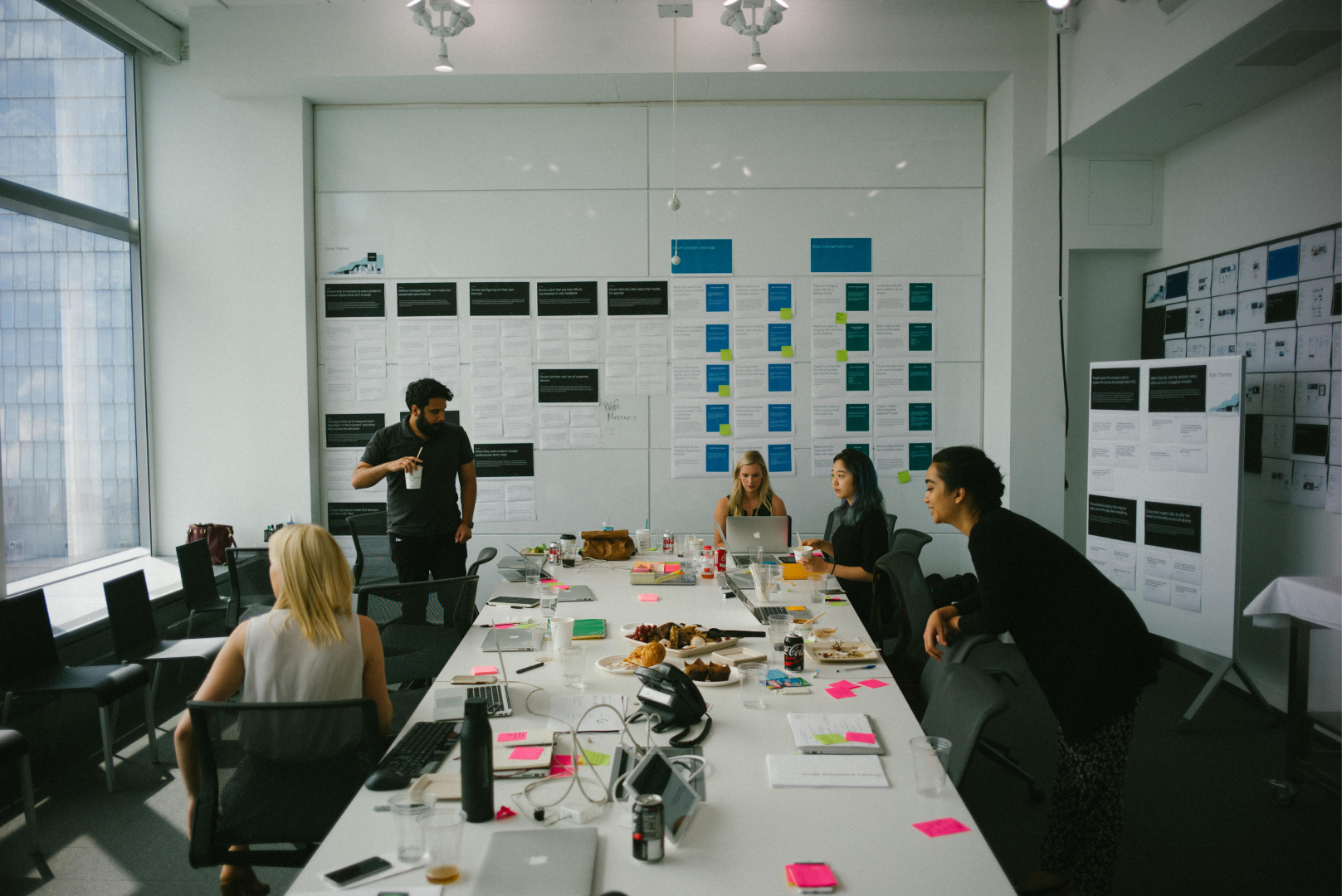
Co-creation Sessions
We shared relevant research themes and insights with the clients. Over a two-day workshop we co-created an early draft of a value-prop and some early concepts for features that had potential to become new focal points of the new Uber.com


Global Validation
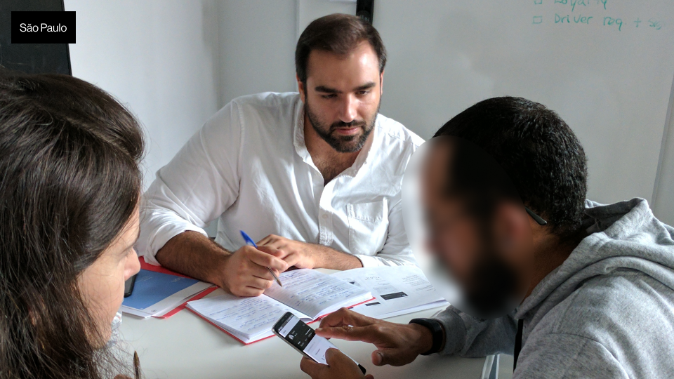
In order to validate our value-prop and concepts, our team designed interactive prototypes and a plan to test them in three global markets (Mexico City, São Paulo, Jakarta) and again in the US (Boston).


Learnings
From the global research we refined our value prop for the new Uber.com. We prioritized features and pages that are most impactful for drivers, riders, and the business.
For Drivers that meant focusing on navigating complex local nuances like different processes for signing up to become a driver all around the world.
For Riders that meant a focus on SEO pages that greatly impact sign ups.
Planning
Collaborative Roadmapping
We planned and facilitated a three day workshop with our clients in order to map out every feature and dependency for the upcoming year and beyond.


Suddenly, a Rebrand
Midway through our engagement, Uber announced a rebrand, which posed a challenge in interpreting the new brand across various website components, modules, and templates.
A key element to the new brand was the "U-frame," a unique, own-able composition for brand recognition. It worked best in mediums with fixed frames like print. But, for a responsive, globally accessible website we we had to interpret a more flexible approach.

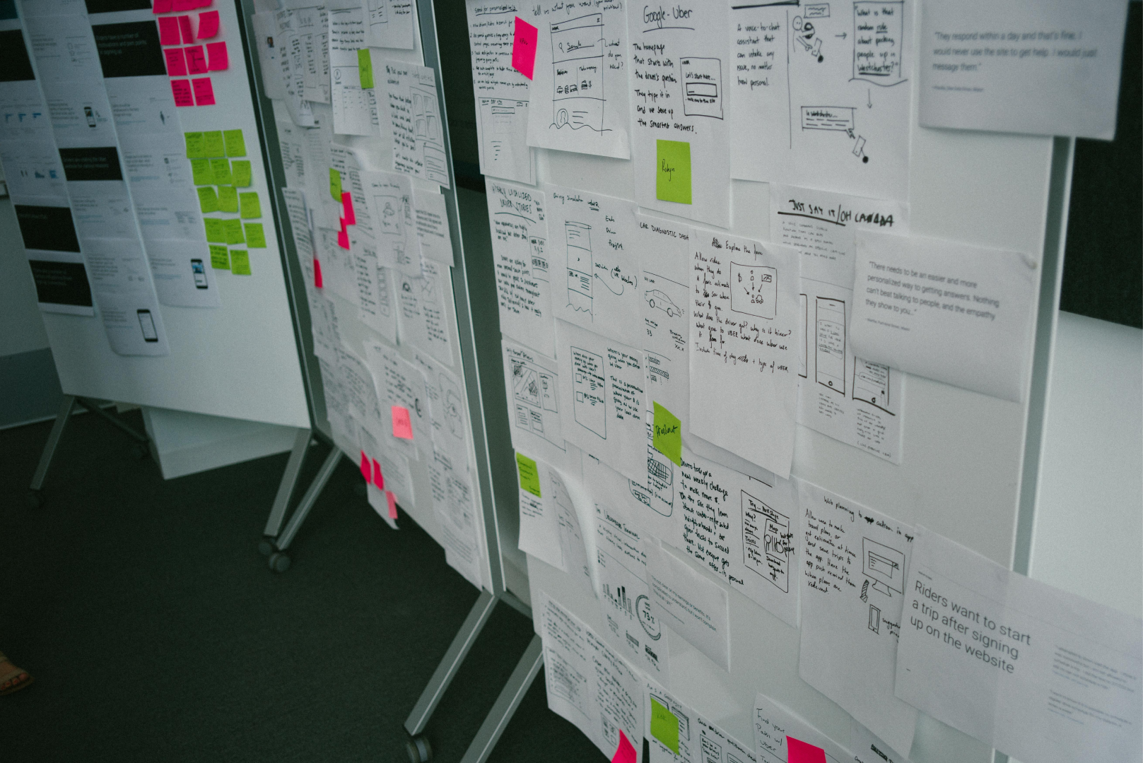
Ideating on how to interpret Uber’s new brand.
A Tiered Design System
Our solution was to approach pages in tiers, each one reflecting an intentional balance of brand expression and functionality.
Tier 1 pages like the homepage utilized components with more brand expression while tier 3 SEO pages leveraged components designed to deliver practical information.
Launch
In September 2018, Uber.com was the first interactive channel to launch the new brand.

Impact
Conversions increased across all redesigned pages!
37% increase in rider sign ups.
Prospective customers were more likely to convert to riders as a result of our work.
28% increase in driver sign ups.
Due to the high paid-marketing costs for acquiring drivers, our redesign was hugely cost-saving for Uber - driving more organic (free) driver acquisitions via the site.
New pages load nearly 50% faster.
Our redesigned WCAG AA compliant pages loaded nearly 50% faster than before - ensuring fast, equitable access to Uber.com.

Select Work

BestWork
Increased confidence in R/GA’s enterprise workforce management tools by redesigning an app with 20 years of tech/design debt.
💻 Best Viewed on Desktop
Beacon for Nike
Consolidated Nike’s internal suite of marketing tools to enable seamless global collaboration in time for the launch of the Nike App.
🔒 Password Required